This website is Two Door Cinema Club's website, they are an Indie Pop/Electro Pop band, who have just recently came about. They are one of my personal favourites as they are fun, catchy, quirky and different to many other bands.
Their website is very simple, yet very effective, it has buttons to different pages within the website, a Home page, News page, Blog, Live, Video page, Shop page, Links and a Contact page. This makes it practical and very easy to read and get around. The font matches the band name, as this is their Logo and Brand.
Information and main pictures are situated on the left hand side of the screen.
This is the panel on the left hand side of the website, it shows the latest news, latest videos and their upcoming gigs. This is very handy as this allows fans who visit the site to simply scroll down and find all the latest news about the band. This is necessary for new bands as they need to get themselves 'out there' as much as possible. The use of contrast on this panel is good too, the background is black, with white boxes for the information, the text within the white boxes is white with a black background so it is readable.
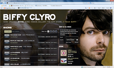
Biffy Clyro are a Scottish rock band and a rather famous one too. This is the homepage of their website, the background is an image of the three members of the band, however, I clicked on shows, to see their layout of the page, and the text box with the information covers the drummer and bassist, and just shows the lead singer and guitarist, as he is mainly the 'face' of Biffy Clyro. The website colour scheme is fair simple, the background images changes on each page, but the text background and the text colour remains the same, which shows a theme throughout. The text background is black with white text over the top, this is a good contrast and allows to text to be read easily.
This is the home page for Florence and The Machine. It is quite busy, with lots of interesting links, however, it is set out in a very readable way. The colour scheme is very neutral, with only hints of colour, which is red, red is a symbol for passion and power, she also has red hair, and is famous for that, this links her to her brand and creates a reoccurring theme throughout.
The text is Serif fonts, which gives an older, vintage feel to the text, making the website look aged, in a fashionable way.
Her debut album was called Lungs, this is what thrust her into the music industry, and featured on the top left of her website is a set of lungs containing links to pages on the website, this again shows brands and allows her fans to link her album to her website.


No comments:
Post a Comment