
This is the original copy of the image we wish to use for our Digipak's Front Cover.
It is an image of our Lead Singer, Tom. It has been taken in Tynemouth where we will shoot most of our music video.
It is an image of our Lead Singer, Tom. It has been taken in Tynemouth where we will shoot most of our music video.

We have edited this image, we adjusted the contrast and the brightness until we were happy with it.
Tom is darker and stands out a bit more, this is what we want as we want the viewer to notice Tom. I really like this photograph, I like the way the path draws your eyes in, as if its leading to somewhere, it has a good composition.

This is the same image we used for the front cover, it has been turned upside down so it fits the layout of the Digipak. We turned the image into grey scale and then drained the colour, altered the contrast and heightened the brightness levels to get the image exactly how we wanted it.

This is the original copy for one of the images we wish to use for the inside of our Digipak. The image is very dark on the whole, but the flash has lit up the person on the left highlighting them and making them stand out.

This is our first edit of the image. We adjusted the brightness and contrast and turned it into grey scale, but we felt like it was still lacking something and could be improved.

We then decided we wanted a splash of colour in the image so we edited it again. This is the final edit of the image, we feel that this is just right, it has a slight bit of colour to attract attention and we feel the grey scale colour scheme fits with the indie/acoustic genre.

This is another image we have decided to use within our Digipak. It is a bit too distant and the composition isn't as good as it could be, so we will edit it until we are happy with it.

This is the final edit of this image, it shows Tom, and his 'Tea Pots'. I like the grey scale effect of this image and the composition is better.

We decided we wanted some colour in this image, to make it fit in with the other images that are also in the Digipak, now that is has a hint of colour in the image it will blend in better with our colour scheme and Digipak as a whole.

This is the original copy of the image we chose to use in our Digipak as the backdrop where the CD goes. We edited it until we were happy with it.

This is the final edit of this image, we altered the contrast and heightened the brightness levels to get this result, we feel that it blends nicely and will work well within the Digipak as it doesn't stand out too much.

This is a list of song titles that we initially came up with to use in our Digipak. Obviously, Charlotte will feature on the album, but we needed to choose another 9, as when we were doing our research and questionnaires, we found out that people would expect to see on average 10 songs on an album.
The 10 tracks we chose for the final Digipak are:1. Let The Sun Shine
2. It’s Not Over
3. Charlotte
4. A Lack Of Colour
5. Learning To Fall
6. Message In A Bottle
7. Mardy Bum
8. Last Summer
9. Miserable At Best
10. Makedamnsure
 This is a pencil drawing showing our basic outlline of our Digipak. It shows where we wish to place things and what is going on our Digipak.


This is our first draft of our Digipak. It shows where each image goes, and where the text will be.
As this is our first draft, this images will be edited, changed and moved around to fit our theme.
 This is the second draft of our Digipak. It shows where each image goes, and where the text will be.

As this is our second draft, most of the images have been changed, edited and tweaked. The band logo has been added too. In our next draft, we will add the finishing touches, have the images edited to the exact way we want them and make sure that everything is in place to make out Digipak look as professional as possible.
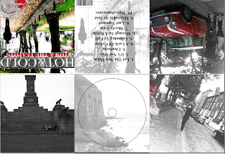 This is the third draft of our Digipak. It shows where each image goes, and where the text will be.

As this is our third draft, most of the images have been changed, edited and tweaked to almost the exact way we want them. The band logo has been added too. In our next draft, our final version, we will add the finishing touches, have the images edited to the exact way we want them and make sure that everything is in place to make out Digipak look as professional as possible.
No comments:
Post a Comment